interpretation
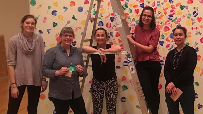
When the students in Brooke Inman’s Introduction to Printmaking got their assignment, they weren’t quite sure what to make of it. They had to take visitor usage data from the Weinstein Center for Recreation and Wellness — and make a work of art.
But pie charts and bar graphs evolved into screen printed sketches of pizza slices and sneakers and heads of broccoli, and signified different hours during the day as well as reasons why people might hit the gym. Saturation of color conveyed peak visitation days.
Crooked Data: (Mis)Information in Contemporary Art featured art from 21 artists and studios who work with data in nontraditional ways. Some might use data as an aesthetic device divorced from its originally function. Others gather data that might normally be considered not worthy of collecting.
“We see data everywhere — graphs in the news about voting statistics, interactive maps on our phones, animated weather radars and charts, and standardized testing scores,” says Elizabeth Schlatter, exhibition curator and deputy director of University Museums. “The artists in this exhibition creatively question our assumptions about how we decide what information is important.”